Shopping Cart

Total

€ 0.00

Continue Shopping

Logo

The most beautiful colors for your living spaces

Blue Velvet von ktCOLOR vertieft den Raum und zelebriert die Kunst
Dark colors can be the most beautiful. They bring depth: 12KT046 Ultramarine Black 85. Photo ©Christian Schaulin
Farbkonzept mit Kreideweiß für ein Haus am Strand
Living space by the Baltic Sea with chalk white 12KT099 Warm Natural White and 16KT002 Dusky Gray, from Droste Architects. Photo ©Nina Struve
Le Corbusiers dunkelste Umbra
Room deepening and elegant: 32KT140 Dark Native Umber. Photo private customer kt.COLOR
Fine living in München Bogenhausen
Elegant and subtle: 32KT004 Silver White and 32KT009 China Clay White from Arnold Werner Architects. Photo ©Boo-Yeah
Silberweiß von ktCOLOR in einer Altstadtwohnung
The same white from left to right! 32KT004 Silver White to 18KT020 Spanish Green. Photo ©Grisard'architectur
Ein Weiß mit Rosestich macht jede Sonnenbewegung mit
The delicate pink at the heart of the magnolia blossom: 32KT132 Burnt Umber White. Photo ©Jordi Miralles
Warmes Rot im Hintergrund und ein raumvertiefendes Stahlgrau
Architecturally strong contrasts! 18KT027 Steely Gray and 32KT009 Pompeian Red . Photo ©Christoph Schuepp
Deckenstuck und Himmelblau, Deckenstuck und Wände wie Sand
The most beautiful colors for a living space in Nice with 32KT143 Pale Native Umber. Photo ©Mikael Brund

Professional color design tips for living spaces

1. Choose the main color carefully – usually a white, soft gray, or beige. There is no such thing as a neutral white. This main color is the most dominant element and sets the mood of the room.

2. Use very bright whites for rooms used during the day. Opt for a muted white in rooms that are also used in the evening or with artificial light, as the brightest white creates gloomy shadows.

3. Which white? Stimmen Sie das Weiß auf die Bodenfarbe, Textilien und Lichtverhältnisse ab.

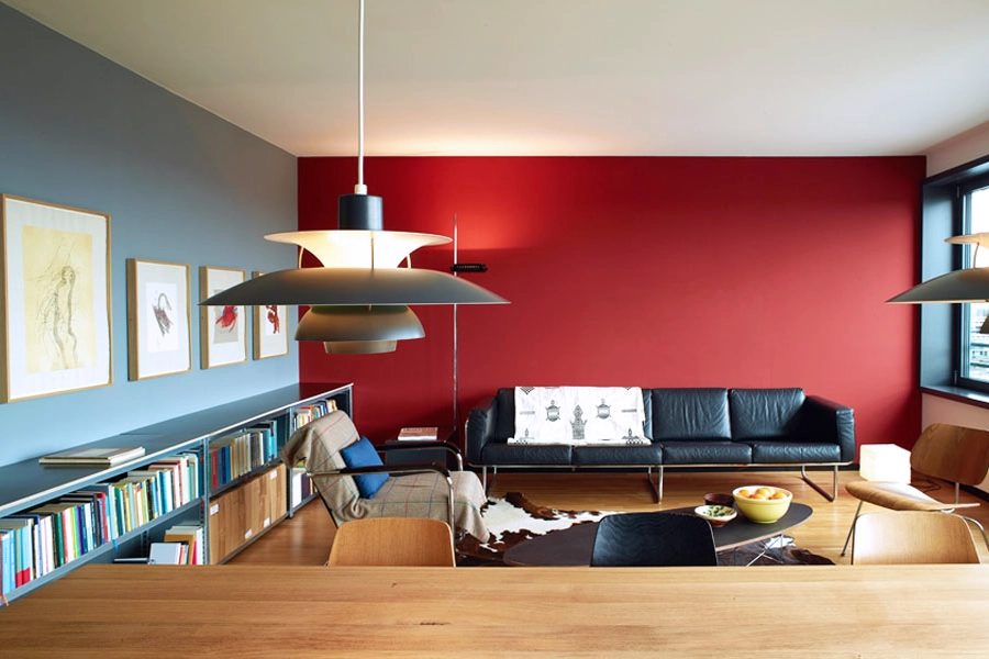
4. Dark colors on certain surfaces add depth to the room.

5. Colorful accents bring energy into the space. Adapt the colors to the landscape and lighting conditions.

6. Natural pigment colors, such as those from ktCOLOR, create harmonious, natural-looking spaces. Artificial pigments and imitations cannot achieve this. The eye cannot be fooled.

7. Choose the paint quality that suits the surface and usage: Emulsion for low-wear areas; Silicate for mineral surfaces indoors (with 0.5 mm grain) and for façades; Satinée for higher wear indoors, for wood surfaces, and in hotels.

8. Think long-term! Timeless colors made from natural pigments and well-coordinated concepts outlast trends and ensure lasting living quality.

9. Ask our experts! We offer personalized advice and are happy to share our extensive experience with you.
Color consultancy