Shopping Cart

Total

€ 0.00

Continue Shopping

Logo
Mit Ausblick und Weitsicht und natürlichen Farben

Color ideas from kt.COLOR - inspiration for wall paints and facades

With ktCOLOR paints and our color ideas, you can create rooms with a beautiful atmosphere that combine architecture, light, function and surroundings into a harmonious whole.

The handmade pigment colors from kt.COLOR for interiors and facades bring your rooms into harmony with the lighting conditions and your individual preferences. Whether warm, earthy natural tones for a sense of security, an elegant white for timelessness and tranquillity or striking accents, our colors shape the atmosphere and define the appearance of the architecture.

On these pages you will discover inspiration for living rooms, bedrooms, dining rooms, kitchens, access areas, public spaces, bathrooms and facades that provide orientation, are aesthetically pleasing and emphasize your style. With kt.COLOR you will find a coherent, harmonious color scheme for every room and architectural style.

Die ktCOLOR Farbe Blue Velvet vertieft den Raum

The most beautiful colors for your living spaces

Colors are essential design elements that define spatial effect and materiality. At ktCOLOR, architects, interior designers and design professionals will find pigment-rich colors with unique depth and high luminosity. Our differentiated scale, from subtle white colors to full black, enables a coherent interior design. Create exclusive, timeless interiors with our handcrafted colors.
Living room ideas

Exterior paints with natural elegance and lasting quality

Natural pigments give exterior a noble and timeless appearance. They relate your architecture to its surroundings and create a fascinating effect depending on the daylight. It goes without saying that our façade paints are exceptionally durable, of high ecological quality, permanently breathable and sustainable. That's why we give a 20-year guarantee on façades if they are painted by a qualified kt.COLOR Master of Colors specialist company. An investment in beauty and durability - inspired by nature, admired by all and made for the next generation.
Exterior ideas
Eileen Grays E1027 strahlt in Lichtweiss von kt.COLOR
Edle Materialkombinationen mit ktCOLOR Spanischgrün, Holz, Seide, Leder und Leinen

Color concepts for bedrooms that bring peace and quiet

Not every blue has a calming effect - but we know which one! Because the wall and ceiling colors in the bedroom play a bigger role than you might think, and the right colors allow calm to return in the evening. They combine with the twilight and immerse bedrooms in a calm atmosphere. Warm earth tones such as Siena burnt or Rosso Veneto, for example, create a cozy atmosphere, promote relaxation and reduce wakeful blue light reflections. Find inspiration for further ideas here.
Bedroom ideas

Dining room colors that welcome guests

Do you regularly entertain guests or do you enjoy your meals in small groups? The dining room is more than just a place to eat - it's a space for socializing and sharing. This makes an inviting color scheme all the more important. Classic colors such as our deep ultramarine give the room an unmistakable identity and a fascinating effect. This blue, for example, creates an atmosphere that inaugurates unforgettable evenings. Let us inspire you with more ideas!
Dining room ideas
Auf die Kontraste kommt es im Esszimmer an - Ultramarin und Holz und Vitra Stühle
In dieser Küche kocht und sitzt und plaudert man besonders gerne dank ausgewogenem Mondgrau im Hintergrund

kt.COLOR colors for kitchens - Comfortable, dignified and healthy

Ein kt.COLOR Farbkonzept für Ihre Küche ist wie ein Slow-Food-Gericht im Gourmet-Restaurant: Es basiert auf den besten, natürlichen Zutaten, ist gesund, nachhaltig und bereitet täglich Freude. Statt schnelllebiger Massenware oder visuellem Fast Food erhalten Sie authentische, tief leuchtende Farben, die Ihre Küche zum einladenden Herzstück des Hauses machen. Die hochwertigen Pigmentfarben schaffen eine warme, harmonische Atmosphäre, die zum Kochen, Genießen und Verweilen einlädt.
Ideas for kitchens

Stylish color concepts for circulation areas that provide orientation

You walk through and move on, but something remains: a memory, a mood that emanates from a beautiful color, an invitation to enter the next room. With our high-quality, hand-painted colors, passageways and stairwells become a moving experience that provides orientation and deepens the overall atmosphere. A well thought-out color concept makes even the fleeting moments in the passageway area special.
Ideas for halls & staircases
Ein Durchgangsbereich, der von Garage zu Wohnbereich führt mit Noir turquoise 85
Die ktCOLOR Farbe Sand entfaltet sich im Hintergrund einmalig

Color concepts for public spaces: function and maximum aesthetics

Colors have a direct effect on the well-being, orientation and functionality of a room. They influence how people move around, concentrate and communicate with each other. The right choice of colors promotes identification with the brand and the learning atmosphere in educational institutions. It sets the scene for exhibits in cultural institutions and ensures intuitive visitor guidance in public buildings.
Ideas for public spaces

Ergonomically optimized colour concepts for working environments

Colors from kt.COLOR bring more light and more vivid reflections into the room. They are easy on the eyes, optimize contrasts and support creative processes. Subtle white and grey colors create optimal conditions for concentrated work. Matching accent colors individualize the rooms. Regardless of whether you work analytically, creatively or as a craftsman - with the natural pigment colors from kt.COLOR you can create spaces in which you can work productively and with inspiration.
Ideas for work spaces
Mit der richtigen Farbe fühlt man sich im Büro wohl - Blaue Eminenz von ktCOLOR
Kühl, frisch und modern in einer Jgendstil Villa - Bleu pale

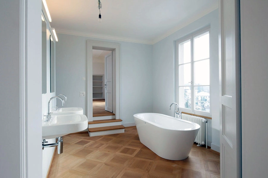
Stylish bathrooms - kt.COLOR colors for calm & aesthetics

The high-quality pigment colors from kt.COLOR transform your bathroom into a stylish oasis of well-being. Their natural radiance creates an atmosphere of seclusion and tranquillity. Warm earthy colors convey a sense of security, soft pastel colors provide freshness and relaxation, while strong colors have a sensual effect. With the right finish, our colors are durable, elegant, timeless and beautiful.
Ideas for bathrooms

Customer testimonials

“It was really a lot of fun, painting with the great product, but also the uncomplicated and competent advice and not to forget the super prompt service, which didn't allow a break in painting. But the best thing is of course the fantastic color that enchants everyone who enters the house.” TS, on 24.3.2024

“It worked out wonderfully and the colors really please us every moment, we are really glad that we chose the colors and kt.COLOR colors in general! The painting work was done perfectly! I am still very impressed by your professional kt.color advice and I almost don't understand anymore why there are only white walls in most apartments!” IW, on 8.1.2025